Season › 2015-16 › News
Everton unveil 2016-17 home kit
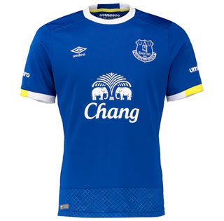
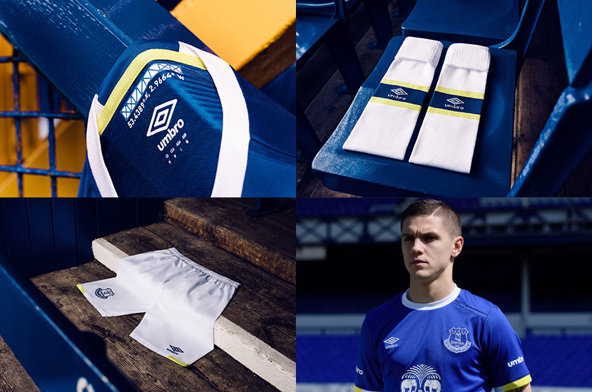
The new design features a rounded white collar and yellow accents on the sleeve trim and a criss-cross pattern at the bottom of the jersey in a nod to the Archibald Leitch iron work that adorns Goodison Park.
A fuller depiction of the iconic Leitch design is featured on the inside back of the neck of the shirt along with the coordinates for Goodison Park.
The shorts are white with yellow accents and the socks feature a yellow and blue band around the middle.
The new strip will be worn for the first time on Sunday when Everton close out the season against Norwich City at Goodison Park.
Speaking about the new kit, Everton captain Phil Jagielka said: “There's nothing like playing at Goodison Park in front of our passionate fans and knowing you are following in the footsteps of some of the greatest footballers in the world. The nod to the stadium and its history in the kit is a great touch. I love the detail of having the co-ordinates on the neck of the shirt”
Supporters will also be able to pre-order at the Toffee Shop on the corner of Gwladys Street and Bullens Road and in the Fan Zone at Goodison Park on Sunday.
Fans can pre-order now the new kit online and in Everton stores when it goes on sale on 4th June.
Reader Comments (68)
Note: the following content is not moderated or vetted by the site owners at the time of submission. Comments are the responsibility of the poster. Disclaimer
6 Posted 12/05/2016 at 07:42:01
7 Posted 12/05/2016 at 07:42:50
Could be our last premiership kit if Bobby Buffoon keeps his job.
8 Posted 12/05/2016 at 07:44:18
9 Posted 12/05/2016 at 07:45:45
10 Posted 12/05/2016 at 07:49:10
11 Posted 12/05/2016 at 07:49:51
However - who really gives a flying f--- at the moment. They should have timed its launch alongside the announcement of our new manager. Wait - launching it a week before the start of the new season? Maybe not.
12 Posted 12/05/2016 at 07:50:46
Oh, and shouldn't that touch of yellow be in the form of a large stripe down the back?
13 Posted 12/05/2016 at 07:52:40
Bears an uncanny resemblance at first glance to the 1997-99 kit which was worn during two season's of struggling against relegation - history will be repeating itself if we're not careful!
15 Posted 12/05/2016 at 07:58:59
I hope the vast majority of this current squad won't be around next season to wear it, when and if the new manager purges this Club.
16 Posted 12/05/2016 at 08:02:02
17 Posted 12/05/2016 at 08:11:44
18 Posted 12/05/2016 at 08:13:41
19 Posted 12/05/2016 at 08:15:52
20 Posted 12/05/2016 at 08:24:21
21 Posted 12/05/2016 at 08:37:55
22 Posted 12/05/2016 at 08:47:24
23 Posted 12/05/2016 at 08:50:59
They mean 2017 don't they?
Or that new marketing team are earning their money for a change.
24 Posted 12/05/2016 at 08:53:29
This one looks better
25 Posted 12/05/2016 at 08:56:03
Reminds me of the Keijian sponsored kit back when Our Wayne was still one of us.
26 Posted 12/05/2016 at 08:58:16
27 Posted 12/05/2016 at 09:07:48
Is the "de-bossed waffle effect" code?!
28 Posted 12/05/2016 at 09:08:22
29 Posted 12/05/2016 at 09:10:12
30 Posted 12/05/2016 at 09:13:18
As if you do Jags. As if you thought to yourself "You know what, I really love that. It's pure genius and..err..super handy if we ever get lost".
They'd have been better off having the co-ordinates of where each player should stand at set-pieces or, for Lukaku, co-ordinates showing him the way out of his own arse.
31 Posted 12/05/2016 at 09:13:45
What makes this joke of a kit even more annoying is the fact that only 2 days previous an absolutely fantastic kit was leaked on social media. It looked really sharp. Obviously too good to be true.
We have got bigger things to worry about than the fact that umbro (who uses umbro in the 21st century ffs!?) are our kit manufacturers and churn out shit like this every year, but I do take a degree of solace in the fact that I am not a parent or someone who will have to buy this rag for a young bluenose. That EFC demand money for this shit is criminal!
32 Posted 12/05/2016 at 09:14:51
Thats the one I seen too! Its absolutely fab!
So disappointed thats not our kit :(
33 Posted 12/05/2016 at 09:18:10
I'd like to see a return of something like the old Latchford Kits both home and away.
34 Posted 12/05/2016 at 09:22:19
35 Posted 12/05/2016 at 09:26:20
All this changing of kits every year is making it very hard for designers to come up with something nice and a little bit different. There all starting to look the same to me. My favourite lot of the last decade was actually Martinez first season with the navy blue.
Spare a thought for the likes of saints, magpies and mackems paying over the odds for a shirt that prob looks identical from distance.
36 Posted 12/05/2016 at 09:28:31
That's a great kit.
Retro looking with a modern appeal... If that makes sense?
37 Posted 12/05/2016 at 09:29:17
38 Posted 12/05/2016 at 09:31:52
The kit is okay but we have far bigger things to concern ourselves with. Maybe we should bring back the terrible kit of 2 seasons' back with that crest. At least we won games in it.
39 Posted 12/05/2016 at 09:37:31
40 Posted 12/05/2016 at 09:38:02
Basically West Hams design from this season.
41 Posted 12/05/2016 at 09:44:38
42 Posted 12/05/2016 at 09:53:38
No collar, no likey.
43 Posted 12/05/2016 at 10:02:33
44 Posted 12/05/2016 at 10:03:47
45 Posted 12/05/2016 at 10:05:32
46 Posted 12/05/2016 at 10:10:42
47 Posted 12/05/2016 at 10:11:35
48 Posted 12/05/2016 at 10:12:29
https://www.grandoldteam.com/forum/threads/new-kits-2016-2017.84918/
49 Posted 12/05/2016 at 10:38:49
50 Posted 12/05/2016 at 10:44:44
52 Posted 12/05/2016 at 10:51:04
I loved that Danka one too of 95, the 1995 Cup Final, oh fond memories and Kanchelskis singlehandedly killing them at Anfield.
On to the new kit, I quite like the top, its ok but as we say and as I said a few years ago when we were all having that mad debate about the badge change, it's not really important, it's the results and the players that wear it.
Having a great kit is nothing if your team is shit.
53 Posted 12/05/2016 at 10:56:02
54 Posted 12/05/2016 at 11:10:06
Not just the on the pitch activities showing a lack of imagination and going backwards then.
The navy Chinese button collar of a couple years ago has been my favourite by far. And the earlier Keijan one with the blue flat collar is nice to wear.
55 Posted 12/05/2016 at 11:27:43
56 Posted 12/05/2016 at 11:36:07
57 Posted 12/05/2016 at 11:57:54
58 Posted 12/05/2016 at 12:08:59
59 Posted 12/05/2016 at 12:18:23
Exquisite!... your comments, not the design!
60 Posted 12/05/2016 at 12:29:54
The togetherness of the design team shines through.
Although they were working with constraints they never lost focus and their effort and intent was immense.
Phenomenal....blibble blibble
61 Posted 12/05/2016 at 15:48:42
62 Posted 12/05/2016 at 15:59:24
63 Posted 12/05/2016 at 16:24:01
64 Posted 12/05/2016 at 18:06:56
The days when we wanted to hang the kopites from the banks but what is with the yellow trimming ?
65 Posted 12/05/2016 at 18:24:26
66 Posted 12/05/2016 at 18:42:01
67 Posted 12/05/2016 at 19:12:16
68 Posted 12/05/2016 at 19:33:00
69 Posted 12/05/2016 at 22:27:14
Perfect. I had one just like that when I was a kid. It had a number 8 on the back of course, and I didn't have to get a new one every year.
70 Posted 13/05/2016 at 00:35:04
71 Posted 13/05/2016 at 03:30:15
72 Posted 13/05/2016 at 08:48:52
73 Posted 13/05/2016 at 15:49:55
74 Posted 13/05/2016 at 16:43:03
Every pro sports team in the world unveils a new shirt etc. etc. etc.
every season.
Doesn't mean we have to waste our money on it.
Add Your Comments
In order to post a comment, you need to be logged in as a registered user of the site.
Or Sign up as a ToffeeWeb Member — it's free, takes just a few minutes and will allow you to post your comments on articles and Talking Points submissions across the site.
-sm.jpg)
-sm.jpg)

-sm.jpg)
-sm.jpg)

-sm.jpg)

4 Posted 12/05/2016 at 07:34:21