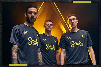
Everton launched the new away kit today, an all black number with yellow trim and detail that takes its inspiration from games under the lights at the Grand Old Lady.
The new second strip features the simplified ‘tower’ crest that was limited to the third kit last season and will make its debut at Coventry City tonight in the Club's latest pre-season friendly.
A club statement describing the thinking behind the new strip reads:
“From the 1985 European Cup-Winners’ Cup semi-final against Bayern Munich, to a bullet Duncan Ferguson header against Manchester United that shook the Gwladys Street and last season’s unforgettable 2-0 derby win over Liverpool, a floodlit Goodison has time and again provided the stage for some of the most iconic moments in Everton history.
"And imitating light through a contemporary geometric pattern, eye-catching yellow collar and sock trims, and a bold yellow Prince Rupert's Tower icon, the away offering is the latest in a series of Castore kits for 2024-25 that find different ways of paying homage to the Grand Old Lady in the stadium’s final season.
"The accompanying away goalkeeper strip – designed with short-sleeves – is a vibrant turquoise, with a striking beige and green pattern and matching turquoise shorts and socks."
It is available for purchase online at evertondirect.com from today and in store at Everton One and Everton Two from Thursday, 1 August.
//
Reader Comments (47)
Note: the following content is not moderated or vetted by the site owners at the time of submission. Comments are the responsibility of the poster. Disclaimer ()
2 Posted 30/07/2024 at 09:52:06
I suppose this just fits in with the world since Covid, because prices have risen, but the standard or quality of a lot of things has regressed, although driving towards Bramley-Moore Dock has become something I really enjoy because the stadium is beginning to look awe-inspiring.
3 Posted 30/07/2024 at 11:25:11
I'll have a walk past the new stadium when I'm up for the Roma match.
4 Posted 30/07/2024 at 11:39:53
His company has won the ISPO Award for innovation in the sporting industry so Castore have been trying to arrange a meeting with them to try to get access to their product technology. They were told to do one.
5 Posted 30/07/2024 at 13:37:23
Finally, a jersey with character.
6 Posted 30/07/2024 at 13:49:19
The Everton jersey — home, away or third option — should have the Everton crest on it, particularly in this age of the global game. We went through enough drama in 2013 getting it back to something worthy of the club after all.
For me, that simplified tower has no personality but I've always liked the all-black change strips.
7 Posted 30/07/2024 at 13:51:46
8 Posted 30/07/2024 at 13:55:32
9 Posted 30/07/2024 at 13:56:46
You just need material and a needle and thread. Simple.
10 Posted 30/07/2024 at 14:06:07
This is not just a drastic mess up by Castore, but also whoever signed it off in Everton marketing.
Surely they can see it's a massive part of our heritage and should never be displayed as a misshapen arrow.
Let's hope there is an immediate apology and U-turn.
11 Posted 30/07/2024 at 14:10:39
12 Posted 30/07/2024 at 14:18:20
There should be a proper badge. A black away kit looks great but a neater trim with white or navy blue would be better than the yellow.
13 Posted 30/07/2024 at 14:20:11
You Luddite!
14 Posted 30/07/2024 at 14:22:22
10 years ago, it was rejected when the badge was changed with 22,000 fans calling for the more traditional design. No consultation this time, so why has it now been done so again?
The dab of yellow bears no resemblance to the tower, or the club in any way. It has no significance or class. If it ain't broke, don't fix it!
15 Posted 30/07/2024 at 14:30:29
Great for leisure wear as a subtle nod to the famous tower, but the actual kits should have the proper badge on them.
16 Posted 30/07/2024 at 14:41:52
Reminds me of a team I once helped out who played in white shirts because everybody had one of some sort or other. And the photo above looks like they've all just gotten out of bed.
17 Posted 30/07/2024 at 14:42:27
The tower 'badge' has been used on the 3rd kit the last 2 years. Now it's appeared on the 2nd kit. The dilution of tradition, hoping no one notices.
Imo, a cost-saving exercise. Much less expensive than a proper crest to produce. Stinks of Castore's low-quality, high-price strategy.
18 Posted 30/07/2024 at 14:57:35
The cost of shirts is a scandal, It does look flimsy.
19 Posted 30/07/2024 at 14:59:08
Technology is destroying the world.
20 Posted 30/07/2024 at 15:15:51
Agree, Paul #17, I always think it's better to employ people who have families to feed than replace them with machines. But I've lived mostly in what is termed "third world countries" or developing countries if you're being nice about it, and if you don't have work, you don't have anything: no food, no education, no health care. No prospects.
21 Posted 30/07/2024 at 15:20:45
The club as a product, nothing more, nothing less. And if you think this is bad, wait until the new Everton Stadium at Bramley-Moore Dock starts up — the way we will be sold to, manipulated, exploited.
The language of product and brand, the very worst of modern day capitalism. Tragic that our beloved football club has been absorbed into this world.
22 Posted 30/07/2024 at 15:55:57
However, these Goodison under the lights nights are so rare. But this century: Lampard v Palace was unbelievable and to be honest Benitez v Arsenal.
I can't count last season v Liverpool as the first home win against them in 14 years.
23 Posted 30/07/2024 at 16:04:21
24 Posted 30/07/2024 at 16:28:55
25 Posted 30/07/2024 at 16:38:28
26 Posted 30/07/2024 at 16:41:16
I won't be buying one, of course, because I am a grown up.
27 Posted 30/07/2024 at 17:00:21
"I think it's great that the away kit is inspired by Goodison under lights and some of the great night games that have taken place there.”
28 Posted 30/07/2024 at 17:09:12
29 Posted 30/07/2024 at 17:16:04
Surely, iconic Ferguson moment was his debut goal against them?
I do like the kit though, having collar love ins over here.
30 Posted 30/07/2024 at 17:24:47
31 Posted 30/07/2024 at 17:30:06
32 Posted 30/07/2024 at 17:37:33
33 Posted 30/07/2024 at 17:41:13
34 Posted 30/07/2024 at 17:53:18
I hope the quality issues are unfounded; as a shirt collector, I'll wait to see if any of my fellow Blues have any issues with our new Castore shirts before any purchase.
35 Posted 30/07/2024 at 17:57:13
Looks like Castore are the current favourite ‘whipping boy' (with very little in the way of player faults to moan about).
I'll take Tony's complaint at face value because he's been able to handle the goods and compare and contrast but, from the announcement of them becoming the kit manufacturers, there seems to have been a groundswell of negativity for what seem to be very subjective things.
I have never handled Castore products but I've seen others wear their stuff and it looked fine. More than that, I've heard people who take their sports and leisure wear much more seriously than me speak very highly of the brand.
Maybe that's what it is? They seem to be very fashionable and booming (despite a few high-profile problems) and that can make things ‘marmite'. Same with being locals made good (especially if allegiances aren't clear).
The articles I read about the wet-look kit made it sound like a performance issue with a high-tech fabric and that seems to have led to lessons learned.
Rugby jerseys have changed radically in my lifetime. The old cotton ones just feel nicer against the skin and the actual durable playing kit had to have a good ‘density'. The new ones tend to feel less pleasant and less substantial but usually have more ‘beneficial' sporting performance in other ways.
I'm not sure you'd choose out of preference to use precisely the same materials for a professional kit and leisure wear versions but, if you use wholly different ones for the proper kit and a replica version, then presumably you will end up with kits that look too different.
Maybe the problem is that the replicas end up being neither one thing nor the other and the Pro versions just aren't actually that comfortable compared to most of the other free-choice clothes you'd wear?
36 Posted 30/07/2024 at 18:40:56
37 Posted 30/07/2024 at 19:02:21
The absolute bare minimum on a team shirt? The team name.
Increasing brand awareness around the world with shirts that seemingly belong to no one but Stake and Castore. Unbelievable.
38 Posted 30/07/2024 at 19:05:32
39 Posted 30/07/2024 at 19:30:13
40 Posted 30/07/2024 at 22:28:38
Shoddy.
41 Posted 31/07/2024 at 00:29:38
And then there's this.
42 Posted 31/07/2024 at 06:53:27
It won't be long before that attempt of a tower is on all 3 kits. Anybody who doesn't like it should let the club know. The more negative noise they hear, the more chance there is to stop them.
43 Posted 31/07/2024 at 07:17:37
We've always had the crest, but not always worn it on the shirt.
In the '70s, we had the simple diagonal EFC. In the '80s, it reflected Prince Rupert's but wasn't the official club crest.
The club crest will always be there, but I personally don't get over excited as to whether it's on the shirt to be honest.
44 Posted 31/07/2024 at 12:14:41
Great to modernise and simplify if it actually looks better, but this has taken every ounce of of character out of the badge.
I could never see those across the park doing similar and replacing the liver birds with a rubber ducky.
45 Posted 02/08/2024 at 21:23:47
Sorry, can't find anything positive to say about it.
46 Posted 03/08/2024 at 12:11:29
47 Posted 05/08/2024 at 22:33:25
Change, change, change — they never give up. Tradition and heritage are dirty words to The Agenda.
"10 years ago, it was rejected when the badge was changed with 22,000 fans calling for the more traditional design. No consultation this time, so why has it now been done so again?"
Christine, yep. Laid in wait and slithered back out for another go. They'll be watching the response, sick little charts will be produced to monitor the acceptance. Not a function of artistic expression or a change of supplier; it's marbled into almost everything.
This aside, the basic kit itself is okay.
Add Your Comments
In order to post a comment, you need to be logged in as a registered user of the site.
Or Sign up as a ToffeeWeb Member — it's free, takes just a few minutes and will allow you to post your comments on articles and Talking Points submissions across the site.
How to get rid of these ads and support TW


1 Posted 30/07/2024 at 09:10:07