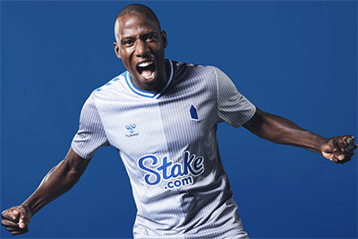
Everton have released the Third kit for the 2023-24 season.
The third kit is a pinstriped design with contrasting grey tones, white base and traditional Everton blue. Grey shorts compliment the kit, with blue and white chevrons, plus grey socks with a blue chevron trim.
Once again, the club's badge has been replaced by a simplified Prince Rupert's Tower icon logo.
The new third kit is out now and available to buy at https://evertondirect.evertonfc.com
//
Reader Comments (41)
Note: the following content is not moderated or vetted by the site owners at the time of submission. Comments are the responsibility of the poster. Disclaimer ()
2 Posted 30/08/2023 at 11:54:24
I wish someone from the Fans Advisory Board would tell the club to stop using the crap version of Rupert's Tower on everything (looks like a bullet) as well and stick to the badge.
3 Posted 30/08/2023 at 11:55:09
Trying to test the waters of the supporters resolve, it's our club regardless of this fake corrupt money that is currently at the helm!
I will not purchase at all, until our true badge is in place.
4 Posted 30/08/2023 at 12:03:40
5 Posted 30/08/2023 at 12:18:01
6 Posted 30/08/2023 at 12:21:31
7 Posted 30/08/2023 at 12:30:33
Who was famous for these words?
Seriously very smart!
8 Posted 30/08/2023 at 12:37:33
9 Posted 30/08/2023 at 12:53:12
Put it on the 3rd kit each year. People get used to seeing the badge. Assess how many negatives v positives about badge.
Eventually put it on away kit too leaving just the home. Then put it to a vote.
I think we could do with updating the badge but going more old-school.
10 Posted 30/08/2023 at 13:09:28
11 Posted 30/08/2023 at 13:38:29
12 Posted 30/08/2023 at 13:53:04
The badge is the issue. Normally I'm against this kind of change, but I see this as making sense. I'd never advocate changing the proper badge, but having a simple, easily identifiable logo as well is actually a good thing for growing the club brand.
Just as Nike own the ‘swoosh' shape and Adidas ‘own' three stripes, Everton can ‘own' a really simple geometric shape and get their brand around the world and into people's consciousnesses more easily.
As a fan base, we complain that the club don't do clever things like this, so I don't think we should complain when they do.
13 Posted 30/08/2023 at 13:56:21
14 Posted 30/08/2023 at 14:00:41
Until the 90s, we rarely wore a version of the official club crest, so it doesn't bother me too much.
Outrage when we had that Nike version.
In the 80s, we wore a crest that had no direct reflection on the official crest.
The 70s classic and simplistic "EFC" on a slant. Give me that every day. That would be iconic.
I personally like the modern representation of Prince Rupert's tower.
Those who know will understand what it means.
15 Posted 30/08/2023 at 14:00:52
16 Posted 30/08/2023 at 14:12:38
17 Posted 30/08/2023 at 14:54:42
18 Posted 30/08/2023 at 14:55:20
19 Posted 30/08/2023 at 15:04:50
20 Posted 30/08/2023 at 15:20:09
If it has white shorts - I can't look - we will not score in it. Players will become suddenly ugly in it, the "organs of increase" will "dry up" (love a King Lear reference), and Jimmy Martin will be turning in his retirement (fantastic interview by the way, heartwarming).
I can't even think of my beloved Neal Maupay with it on. It will make him look like a third-rate striker who hasn't scored a goal for nearly a year.
"And you go home, and you cry, and you want to die".
21 Posted 30/08/2023 at 15:23:01
22 Posted 30/08/2023 at 15:44:37
And haven't the board learnt the lesson from the previous release of the Mickey Mouse Clubhouse inspired badge?
23 Posted 30/08/2023 at 16:06:01
24 Posted 30/08/2023 at 16:21:00
It does look "greyish". But grey? What a dull, dreary, drab, dishwater, gloomy, rainy day, resigned colour. At least something day-glo could be inspirational and get noticed.
This dirty towel looks like a relegation scrap.
25 Posted 30/08/2023 at 16:21:18
Is it subliminal messaging that we're fcuked?
26 Posted 30/08/2023 at 16:36:52
27 Posted 30/08/2023 at 16:39:59
agree - leave the badge alone. I like the tower but as an addition/trim item.
My cynicism is such that I predicted this to a friend the first time the tower appeared on the first team shirt. Little is left that isn't subjected to the ongoing change culture, and it's often done in the same old creeping way, so Andy @ 9 is likely correct.
The broad design, I like (from only this one pic so far). Not that we have ever needed or would need a third kit.
Paul F @ 20 - hang in there, Lad. You'll feel better after the first win.
28 Posted 30/08/2023 at 17:03:01
29 Posted 30/08/2023 at 17:05:03
30 Posted 30/08/2023 at 17:07:28
31 Posted 30/08/2023 at 17:07:58
32 Posted 30/08/2023 at 17:10:15
33 Posted 30/08/2023 at 17:11:42
34 Posted 30/08/2023 at 17:42:20
35 Posted 30/08/2023 at 18:11:58
36 Posted 30/08/2023 at 18:48:06
37 Posted 30/08/2023 at 19:06:18
It's a nice kit but shame the badge isn't normal or fans can't buy it without the huge gambling sponsor on it. I honestly believe fans shouldn't be used as advertising boards (and pay for it).
38 Posted 30/08/2023 at 20:05:34
39 Posted 31/08/2023 at 01:50:02
40 Posted 31/08/2023 at 22:07:40
41 Posted 01/09/2023 at 14:07:03
Replace grey with green and it would be lovely.
Add Your Comments
In order to post a comment, you need to be logged in as a registered user of the site.
Or Sign up as a ToffeeWeb Member — it's free, takes just a few minutes and will allow you to post your comments on articles and Talking Points submissions across the site.
How to get rid of these ads and support TW

-sm.jpg)
-sm.jpg)

-sm.jpg)

1 Posted 30/08/2023 at 11:43:17