


Crestfallen – The Undermining of the Everton Brand
The custodians of the Everton brand are displaying a gross misunderstanding of our club's traditions, aspirations and image. It also doesn't seem like they are listening. The new badge is an abomination and should be stamped out now before it really is too late.
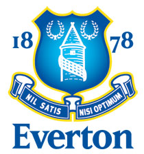
If it ain't broke...
Much of being devoted to a football club is an irrational business. The intensity of the passion, the depths of depression at the lows, the soaring elation at the highs... there's not much logic to it but at the same time it's perfectly in keeping with the human condition.
The community, the feeling of belonging of Being Blue, being an Evertonian, however, is more obvious on its face. There are so many reasons why we were drawn to this special club, chosen as the passage we have adapted and adopted as our own goes, and at its heart is an identity.
That identity revolves around the famous club crest. Perhaps only the iconic image of Dixie Dean which was cast in bronze outside Goodison Park or the Prince Rupert's Tower itself can come close to rivalling the crest as a single unifying, visual hallmark for Evertonians.
We paint it on the side of our houses, use it as wallpaper on our computers and smartphones, as avatars on social media and forums, and we lovingly tattoo it on our bodies.
Though elements like the year of the club's founding and the word "Everton" itself have been added in recent times, the core, ever-present elements first envisaged by Theo Kelly have formed that unifying identity and, until now, it was our emblem. Any decision to modify or evolve it should not have been taken lightly.
As the most visible and omnipresent marker of an organisation's identity, its logo is an inextricable part of the brand. It should express the character, vision and mission of the organisation. There is a science to logos. The design of corporate marks is an industry itself; companies pay professional agencies thousands of pounds (sometimes tens of thousands) to design them, to construct a brand message, to convey the organisation's soul to the world.
As the standard-bearers of the club's hopes and aspirations and unashamed revelers in its history, Evertonians envisage Everton's brand as encapsulating prestige, tradition, success, longevity, resilience, pride and elegance. School of Science, anyone?
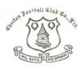
Theo Kelly's 1938 design
Kelly "puzzled" over his original 1938 crest design for four months and the result of his patient deliberation was an encapsulation of the spirit of Everton FC: the Tower on Everton brow in the centre, "two laurel wreaths resplendent", Olympian symbols of "success", on either side, and underneath a heraldic shield, the motto "Nil Satis Nisi Optimum" which has, until recently, been the guiding principle of one of English football's most enduring and pioneering insitututions.
At a time when Everton's Marketing and Communications department has been making great strides in terms of innovation, particularly in the branding and digital arenas, the tacky nature of the new badge is wholly at odds with much of the Club's character. (Perhaps it's not surprising that the change in identity was led by two non-Evertonians in the form of Director of Communications, Paul Tyrrell, and Commercial Director, Dave Biggar.)
Big expenditure on branding by no means guarantees the creation of a successful or attractive mark, of course — the logo for 2012 London Oympic Games cost in the region of £450,000 and was roundly maligned for its ugliness — but by choosing to go in-house as Everton, a multi-million pound company operating in a multi-billion pound space, apparently have, the club have compromised the brand by delivering a badge that cheapens its image and erases decades of tradition, seemingly for commercial expediency.
The rationale as explained on Everton's official website is that the old crest was "difficult to reproduce" in the digital age — a perplexingly contradictory argument, especially given the intracies inherent in the likes of Manchester City, Newcastle United and Manchester United's crests — and suffered from frequent misrepresentation in the media, with some of the floating external elements like the motto and the "1878" characters being left out. Rather than use the pretext of "modernising" the crest as an opportunity to tighten up the design to mitigate these complaints, they opted instead for sweeping simplification that casts aside tradition and plunges headlong into the aesthetics of low-budget clipart.
If, at the behest of our overlords Nike and Kitbag, the driver is iron-on convenience, why not just float the existing badge (or a version thereof) in a larger heraldic shield? But then, if it's a third party driving your branding decisions, you've surrendered control of your brand anyway, undermined your own image and, judging by the reaction so far to this enormous mis-calculation, alienated a large portion of your customer base.
Re-branding through corporate identity is a monumental decision with huge implications — re-printing of merchandising, advertising hoardings, placards, kit ranges, stationery, etc — but with merchandising orders already placed, that process is already underway and reversing this decision — as sense would seem to demand — is not going to be without its costs. It's not impossible or without precedent, though.
Four years ago, orange juice producer Tropicana performed a very public but ultimately effective volte-face in response to a customer backlash to their logo and packaging redesign.
Some of the feedback that Tropicana received through emails and letters described the new packaging as “ugly” or “stupid,” and resembling “a generic bargain brand” prompting the company to restore the original design, choosing short-term financial pain over long-term harm to the brand. Neil Campbell, president of Tropicana North America, explained the decision saying: "We underestimated the deep emotional bond” they had with the original packaging. Those consumers are very important to us, so we responded."
Of course, had the leak of the logo to the wider audience of Twitter and Facebook — and, by extension, fan websites like ours — come earlier, this whole mess could have been avoided. In 2010, as part of it's own attempt to represent its evolution, US-based clothing manufacturer GAP floated the "trial balloon" of a new logo on the Web and quickly abandoned the idea after receiving overwhelmingly negative feedback.
"We heard the message loud and clear," said Louis Callagy, a spokeswoman for GAP said at the time. "It's clear we did not go about this the right way. In the future, she said, the company would make more of an effort to "engage with the online community." Brand damage and enormous cost averted.
Having allowed the process to get as far as it has without casting the net of consultation wide enough to catch the first whiff of supporter disapproval — the Fans' Forum was either too small or too sycophantic a sampling of Evertonians or they just weren't listened to — this could be a costly mistake for Everton whatever happens from here, depending on how much effect the new badge will have on merchandise sales.
At a time when many Evertonians are becoming increasingly disillusioned about the running of the club and its place in the current Premier League order of things, and feeling particularly uncertain about the future following the departure of David Moyes, this controversy is certainly ill-timed. How the club reacts, if they do so at all, will speak volumes for its relationship with a large spectrum of the fanbase.
As it stands, the custodians of the Everton brand are displaying a gross misunderstanding of our club's traditions, aspirations and image. It also doesn't seem like they are listening. The new badge is an abomination and should be stamped out now before it really is too late.
What can you do?
To contact the club with your reaction to the new badge, email everton@evertonfc.com or send a tweet to @Everton. You can also sign this petition and follow @NoToNewEFCBadge on Twitter.
 Follow @Everton1an
Reader Comments (108)
Note: the following content is not moderated or vetted by the site owners at the time of submission. Comments are the responsibility of the poster. Disclaimer
2 Posted 25/05/2013 at 23:16:29
The Peoples Club could potentially face a Peasants Revolt this summer. The Board have so many decisions to make over the coming weeks with the appointment of a new manager and the EGM to name but two.
Whatever happened to the stability we once enjoyed, hey.
3 Posted 25/05/2013 at 23:40:24
4 Posted 25/05/2013 at 23:34:55
5 Posted 25/05/2013 at 23:51:14
I just hope the club (BK) uses the same logic and forward thinking approach in appointed our new manager.
The badge is modern yet BK said last week Everton was an old-fashioned, hard-working industrial club.
Interesting times ahead!
6 Posted 26/05/2013 at 00:03:56
7 Posted 25/05/2013 at 23:57:29
Yes, I understand that modernising certain areas of the club is needed but not our crest. I feel that the crest represents who we are, how rich our history is and I'm certainly proud to have the word Nil Satius Nisi Optimum displayed on there.
I'm up for change but not with the rubbish that they've produced!
Here's something they can attempt to modernise, try some areas of GP! Joke!
8 Posted 26/05/2013 at 00:15:09
9 Posted 26/05/2013 at 00:11:52
Dropping the motto is unforgiveable, but I don't suppose many who work for the club actually believe it anymore.
10 Posted 26/05/2013 at 00:15:28
For those that say it is just a badge, well I don't understand you, I suppose it wouldn't matter if we moved to another City or another Country or renamed the club Liverpool Seconds, or if we just faded away and became another Accrington Stanley - who I think have a complicated badge which nobody thinks is difficult to reproduce - if the people who support the club don't care about what happens then I really don't know what the point of being a supporter is.
11 Posted 26/05/2013 at 00:17:39
12 Posted 26/05/2013 at 00:31:55
13 Posted 26/05/2013 at 00:33:20
Absolutely, there are so many responses I see on all kinds of issues that are..
"Who cares?" "move on" "Is it important?" "does it matter?"
Well look at the petitions, twitter, facebook, TW etc etc - it's Everton, of COURSE it fucking matters.
14 Posted 26/05/2013 at 00:32:02
There is ONLY ONE WAY to make these people listen. DON'T BUY ANYTHING WITH THIS BADGE ON IT. I have had the programme subscription since 1982, but that stops now as does the purchase of any kits or merchandise. That badge is embarrassing. Quite honestly EFC are embarrassing. They are fucking useless!
15 Posted 26/05/2013 at 00:40:46
A laurel wreath is a circular wreath made of interlocking branches and leaves of the bay laurel (Laurus nobilis), an aromatic broadleaf evergreen, or later from spineless butcher's broom (Ruscus hypoglossum) or cherry laurel (Prunus laurocerasus). In Greek mythology, Apollo is represented wearing a laurel wreath on his head. In ancient Greece wreaths were awarded to victors, both in athletic competitions, including the ancient Olympics made of wild olive-tree known as "kotinos" (κότινος),[1] (sc. at Olympia) and in poetic meets; in Rome they were symbols of martial victory, crowning a successful commander during his triumph. Whereas ancient laurel wreaths are most often depicted as a horseshoe shape, modern versions are usually complete rings.
In common modern idiomatic usage it refers to a victory.
The expression "resting on one's laurels" refers to someone relying entirely on long-past successes for continued fame or recognition, where to "look to one's laurels" means to be careful of losing rank to competition.
I wouldn't be surprised if the person responsible for removing the Laurel wasn't given a Hardy hand-shake by Mr B Kenwright - the old jokes are always the best.
16 Posted 26/05/2013 at 00:41:12
17 Posted 26/05/2013 at 01:15:24
Just who are these idiots on the supporters forums that gave the club the thumbs up to this design? I would feel better if they just came out with the truth and said it was done to save money with printing costs etc etc..... Well guess what, stupid board — it won't because Evertonians will boycott this new badge because it's horrific.
18 Posted 26/05/2013 at 01:15:53
Nil satis nisi optimum will forever be our motto and part of our history but the new market don't feckin understand it... It's Latin.
We slag the club off for not being commercially aware then we critize when they act proactive.. By the way wether u like it or not Nike the masters of marketing advised us.
Oh they never consulted the fans.. I don't blame them reading half of these comments.
Get over it.. You all will.
19 Posted 26/05/2013 at 01:32:43
21 Posted 26/05/2013 at 01:38:58
From an earlier thread - the riposte, cut me to the quick
"Nick Armitage
096 Posted 25/05/2013 at 22:22:04
Phil Bellis - Because I don't care about a badge, and let's face it, plenty them have been shite down the years, this means I don't understand? A well reasoned and rational argument"
We've got no chance - the mind boggles!
22 Posted 26/05/2013 at 01:51:43
Even when attempting to attract new fans the heritage and traditions of a football club should not be cast aside lightly.
Saying things have changed before doesn't actually justify changing things now. The only criteria that really matters is whether the result is an improvement that went before or not.
24 Posted 26/05/2013 at 01:20:25
Maybe this is the way the board see our future direction? Create a 'brand' (I so hate that word) that any generic, impartial viewer/gamer can immediately identify with and form an immediate bond, so as to widen our fan-base. The new badge is more striking in the respect of being quicker for the eye to interpret and imprint in the mind, which of course is the reason why it has been dumbed down; who needs to see a latin phrase which requires interpretation? To reach out to new 'followers of the brand' this would make sense; as these new followers who watch the games have no regional bias and if they can see a badge or label that is easy to identify with, then they may feel more comfortable with associating with that in the future.
However, this way of trying to branch out to untapped markets doesn't consider the retained market. Those that are hooked on the brand and are going to stay loyal, come what may, are having their opinions marginalized to the point where they don't matter. The board will probably reason that no lifelong blue is going to suddenly change their allegiance due to a badge change that is similar to the original; albeit it looks like it has been haphazardly etched into the pebbledash, by the clawed fingernails of Rod Hull falling off a roof.
I personally don't believe any blue will support another team due to this badge change. I also believe the board know this and this is why they are bulldozing this through, whether cajoled by Nike/Kitbag or not, as they feel it will improve our global 'brand'. Also personally, I think this whole things shits on us fans, the ones who will be here, whatever the weather, the ones who make Everton Football Club what it is.
Why not go the whole hog and change our name to the 'Merseyside Blues'?
25 Posted 26/05/2013 at 02:48:03
26 Posted 26/05/2013 at 03:38:14
27 Posted 26/05/2013 at 03:49:47
28 Posted 26/05/2013 at 04:39:19
This is a fantastic opportunity for them to show how much the opinion of the fans means to them. Listening to this kind of feedback would generate much respect for the club. On the other hand, ignoring us would do the opposite.
At the very least a response should be made by the club. Either it will be that they listened and took action to restore the old crest, or it will be that the opinion of the fans don't matter and that designers and a group of "experts" know better.
29 Posted 26/05/2013 at 05:11:15
"I cannot kiss this badge any more than I could kiss Steven Gerrard (a Kirkby kiss maybe!)"
.... strong enough?
34 Posted 26/05/2013 at 07:09:13
I've been through design/rebranding processes like this professionally and learned a few things along the way.
The 1983 version was, to be fair, actually a bit shit if we're honest. The point is, is this an improvement...
Firstly the colour: this was not Royal Blue, which always bothered me: it was a horrible mid-blue, and worse, from a reproduction point of view, the background had a cheesy looking fade and drop-shadows that are supposed to give it depth, but make is less crisp and clear: these needed to be addressed.
What else? The word Everton - which used an awful, generic font and hence looked crap. Subliminally, using this name at all betrays a lack of confidence - like "you won't know who we are unless we tell you"
Next, the laurel leaves - inside the shield, up-top and small, they would disappear if reproduced at a small scale.
Then the 1878: if you use a font in a logo, use the same one - a heritage font for the numbers and a crap modern one for the name, it looked crappy.
And the motto: there was a (weak) argument for sidelining it, based on its lack of 'modern-world relevance' - but this was a big miscalculation: you are what you project yourself to be: so a motto that stands for the vision of the club, and positions us as a proud, tradtional, authentic founder member should have been accentuated, not done-away with. This is the biggest crime of the lot.
The tower: this could have been argued to be a bit detailed or out of proportion to the real one - but the use of heavy and pointless shading makes it worse than it was.
And finally, for me, the yellow border, which just looked crap, and should have been removed.
So having done some analysis of what to keep, what then?
To craft a successful logo it needs to be crisp, sharp, clear and recognisable at all scales, from the size of a twitter avatar on a mobile phone, to an embroidered shirt or hat badge, up to a billboard or a huge flag. And it should reproduce just as clearly in monochrome / black and white / grayscale. And it should 'work' as an icon alone, or with optional associated textual elements (think Nike swoosh +/- the word Nike, or the Liver Bird +/- LFC)
So does this revision work on any level?
Well, for me, they got the blue right. And that's it.
Otherwise, they have retained, accentuated or emphasised all the worst aspects, and destroyed or diminished everything else that speaks to tradition, heritage, values and authenticity, while STILL not achieving the necessary clarity, simplicity and crispness needed for the revision to be a) justified or b) accepted by the brand's customers / owners.
In marketing/design speak, it is a horrible fucking abortion, and don't even get me started on the "consultation" process.
In my view, all those responsible for conceiving, designing, managing, endorsing or approving this process and its final outcome are traitors to Everton and deserve to be set on fire.
Once again we are humiliated and compelled to decide whether to hurt our club by voting with our wallets and rejecting this insult in all its forms.
When will Evertonians wake up and fucking DO SOMETHING to take our club back from these muppets, or at least send them a message in a form that hurts and humiliates THEM and not the Club?...
Sit-down protests on the pitch, or on Goodison Road? Blockade the directors' car park and Club Shop on match days? Stop buying all merchandise, right down to programmes and matchday pies... Email all the club's sponsors and service providers to tell them this boycott will extend to all THEIR products too (Sky, Nike, Kitbag, Chang, StubHub..? Unsubscribe from all forms of Club social media/emails...? All stand and Point at the Directors Box on 18 and 78 minutes...
Whatever you do, commit to DO SOMETHING, and stuff the happy clappers if they don't like it.
35 Posted 26/05/2013 at 08:34:31
I agree that this one also does but I really don't care, the club have far more important issues, like the ESA called shareholders meeting and the new manager.
Like it our not we will be dictated to by massive commercial interests, and I don't like being at the behest of Nike, but look at the flip side, we are entering a summer tournament that we could only have dreamt of a year our two ago; I strongly suspect Nike had a hand in this.
I don't like this crest, but then again I thought the last one was over fussy. Arsenal went down the same route years ago and I remember their vehement protests; it ain't made much difference to them has it?
Unlike everyone else I really don't care about this crest. But insinuating that I don't understand because I am not outraged is simply infantile and pathetic.
36 Posted 26/05/2013 at 08:57:24
'Unlike everyone else I really don't care about this crest. But insinuating that I don't understand because I am not outraged is simply infantile and pathetic.'
The fact that you 'don't care' is certainly a worry. If you passionately liked the badge or even thought it was ok, I could appreciate your view. But to not care? You don't care about the identity of the club you supposedly love? Well what else is there to care about?
37 Posted 26/05/2013 at 09:32:38
39 Posted 26/05/2013 at 09:44:49
Can't stand it all.
When you argue or disagree vehemently with some items on ToffeeWeb you are asked"Are you an Evertonian".
I am - 56 years+ going to Goodison - now with my 42 year old daughter and 21 year old Grandson - steeped in history.
If you allow yourself to accept hype on one thing - - like acceptance and "topping your hat gratitude" of being grateful for finishing in the top 8 for a few years - then do not be surprised that the "powers" believe they can sell you anything.
I am 64, a Blue, and like Marlon Brando when he was asked "what are you protesting about now" - - Brando answered "what have you got".
Never trust Marketing Men, Consultants, anyone in a double breasted suit wearing brown brogues.
Long Live The Luddites.
40 Posted 26/05/2013 at 10:23:22
These working groups who look at this sort of thing give themselves a self gratifying sense of collaboration. But they end up suffering from something called group think (look it up it can fuck up a lot more seriously than our club badge). I worked for a bank which very nearly launched a bank account the brand monkeys wanted to call "the working women's account" only when it got to us dullards in IT was there any suggestions it might be misinterpreted...
42 Posted 26/05/2013 at 10:35:33
And when did I say I didn't care about the identity of Everton? Read what I have written and don't put words in my mouth. I have said I don't care about a badge, one badge in a long succession of generally poor and uninspirational badges, NOT the identity of a football club. I do prefer the last badge, but I can understand in these times why the club has changed it.
If Kenwright hires Martinez there won't be a backlash of this magnitude, and we all should find that far far more worrying. Don't let me not caring about a badge worry you.
44 Posted 26/05/2013 at 10:47:35
For years, there've been hundreds of posts on this website criticising the club for not doing enough to maximise the potential of the American and Far East markets. This badge is designed to help do that. The previous badge had no clear brand. If you sold a shirt to an American, they'd have no idea who the hell we were. If you sold a shirt in China, why would they give a shit about a Latin motto? Football in the PL era is different now, we need money to compete. It's no longer about local fans and because of that some 'traditions' will be sacrificed. Money is made through the foreign markets so we need to appeal to them with a clear brand. It's probably why the club didn't consult with local fans about the badge.
As an owner of my own company, having a clear and precise brand is very very important. If you see a van with the brand 'Brilliant Plumbers' on you know what they do rather than 'Clarke & Sons'. Unfortunately Everton is not the same as Manchester or Liverpool because apart from the local fan base no one knows where the hell it is. Hence why the new badge is designed to tell everyone who we are, especially Americans. We can't trade off our place name.
It is no coincidence the new badge was announced on the same day as announcing our involvement in a high profile tournament in the US against some illustrious European teams. Because of their history, Real, AC Milan and Juventus are already well known. When we play against them, US fans won't know who we are.
Out of interest, our old badge was only introduced to the shirt in 1991 so it's hardly like the club are doing away with some time honoured tradition. I note from the names criticising the club now, they're the same people who criticised the club for not doing enough in America.
We shouldn't be arsed about this, there are far bigger fights to be had. The appointment of our next manager is the biggest one and anyone moaning about a new badge rather than focussing on real football matters needs to have a serious word with themselves.
45 Posted 26/05/2013 at 10:19:14
The next time I'm buying a wool hat with the new logo I probably won't think that's a shit logo so I'll not bother, or if some oil rich oligarch is decidng to invest he's not going to say I'll not bother because the club have crap logo
The re-branding is a simply a marketing decision with no doubt a sound commercial rationale that's aimed at a wider global audience, we're not going to stop supporting the club becuase of a few tweaks to a logo so why get ourselves wound up by it. Heritage and tradition?
46 Posted 26/05/2013 at 10:40:40
We have no manager
We have no investment
We have an old crumbling stadium
We have increasing discontent with the board - EGM's etc..
It's all right thought, here's a new badge! That'll cheer the fans up . . . . apart from the fact that the new design is far too basic and looks very cheap in comparison to the current one.
The Board have their priorities seriously wrong if they thought that the badge needed revamping was really important to the fans..It's all about money and that money is not going to be invested into the team.
47 Posted 26/05/2013 at 11:34:10
I have just read a comment saying the new badge, 'will grow on me'. Yes mate, and a cancer will grow on you too. It's ironic that what this badge completey symbolises now is the ineptitude of the current board and decision makers at the club. EVERTON FC is a club ran by a group of people with a SMALL CLUB MENTALITY. This now, is undeniable.
I was looking forward to the excitement of a new manager, but now I realise we are at the mercy of a group of clowns who can't be trusted to do ANYTHING right. The way we are heading right now is scary. In a couple of years will any of us be able to identify with this club still?
48 Posted 26/05/2013 at 11:31:55
Perhaps he's Shane Duffy?
Tim 213:
I think this new badge is part of the Club's tendency to massage our expectations downwards.
Removing the laurels seems to signify that they no longer expect to win anything. As for removing the Nil Satis Nisi Optimum... well, it speaks for itself, doesn't it?
Liars, charlatans, hypocrites, amateurs - losers, basically - run our Club.
50 Posted 26/05/2013 at 12:06:03
51 Posted 26/05/2013 at 11:59:12
Chris, Si Cooper hits the point bang on, if change is needed, change for the better, not the worse. I hope to God that you are not one of the "fans" the club claim to have consulted about this badge, you appear to be one of the only ones who regard it as an improvement. If "being commercially aware " is producing something as dire as this, words do, indeed, fail me. As for not consulting the fans, what is a club WITHOUT fans? Pathetic comments.
52 Posted 26/05/2013 at 12:12:28
53 Posted 26/05/2013 at 12:14:44
One of the more amusing aspects of this whole debacle is that the club claim they used an in-house design team because an outside agency wouldn't understand what the crest meant to Evertonians.
54 Posted 26/05/2013 at 12:39:03
I totally agree with every piece of your post and have already decided to do something; although my only merchandise buying only stretches to buying the shorts and socks to wear at the gym, which stops now, I have also made the biggest decision with regards to Everton to date....
I will not set foot inside Goodison Park until the current regime has gone. The Everton I see today is unrecognisable to the one I chose to support in the late 70s, even though my father and brothers were following THEIR team to unstoppable glory.
55 Posted 26/05/2013 at 12:41:21
57 Posted 26/05/2013 at 12:54:56
60 Posted 26/05/2013 at 13:26:28
I know that I'm a bit boring, but I just want to suggest that we maybe should 'unlike' the Everton FC Facebook page until they bring back the old crest.
NSNO
62 Posted 26/05/2013 at 13:30:46
63 Posted 26/05/2013 at 13:45:48
Visit...
http://www.historicalkits.co.uk/Everton/Everton.htm
Scroll to near the end to see the badge(s) you refer to - nothing like
And take a look at the classy, clean 1991 version, while you're there
Contrast and compare to the new abomination
64 Posted 26/05/2013 at 13:51:31
Anyway, think about it: this is the management team that brought you Kirkby, Kings Dock, lied to you, misled you, prevented its shareholders from asking difficult questions. An now, cheapened a brand of quality. It wasn't broke so why did it need fixing?
Are they so out of touch? Do they really think they know better than the views of just about every Evertonian?
The door is firmly shut to fans at Everton FC.
Leadership? Kenwright – you're a disgrace. Elstone?? Where are you, you spineless wimp?
I am all for change; change that is considered, wise and justified. So, come on: Justify it. Where was the huge call for change? (Hard to reproduce??? My god they must still think we use Singer sewing machines...)
To hell with them all.. All we need now is a nice manager from a northern town with no money or another Scot with no qualifications.
65 Posted 26/05/2013 at 14:17:25
67 Posted 26/05/2013 at 14:24:47
68 Posted 26/05/2013 at 14:27:48
71 Posted 26/05/2013 at 14:52:42
I wondered how well the Everton brand is actually known throughout the world. Very little is the probable honest answer. However, like everyone else, I'm very annoyed to see the removal of Nil Satis Nisi Optimum. Surely Nil Satis could've been added to the the left and Nisi Optimum to the right? I don't think there would've been as much uproar if that was the case. And if that is the only adjustment then surely it won't be too complicated to add to it.
72 Posted 26/05/2013 at 15:01:17
The current badge has been on the kits since 79, my mates Dad has it on his grave, these fuckers have ripped it apart, fair enough alter it a bit with class, not like a Primary school competition.
73 Posted 26/05/2013 at 15:05:45
75 Posted 26/05/2013 at 15:20:48
The club has its little nest of hand-picked nodding dogs who claim to be fans and these people are supposed to represent us. Now maybe these people are 'real fans' but they are put in a position where they either say "I love it" or they are booted out of the group and a more compliant fan is brought on board.
We all know the big Everton fan sites - couldn't the club cast an eye over the opinion polls and see what a resounding bashing the crest was getting even before its release.
I had to laugh at the Everton Twitter feed when they announced the new crest - they had purposefully lined up about 5 tweets to announce it, justify it and then list a host of top clubs who have also changed their badges in recent years. They were obviously expecting the backlash they received. The final tweet actually showed Barkley wearing a top with the new motif on - it was fucking enormous. If they are that size on the kits then god help us.
76 Posted 26/05/2013 at 15:38:57
That just shows me how inept they are. Either not to look at those sites, or to look but think they could just ignore the strong feeling against the new design.
77 Posted 26/05/2013 at 15:53:15
78 Posted 26/05/2013 at 15:45:09
To say they consulted someone, were they even shown the design? The propaganda on the OS is just a load of crap.
"Evolution"?, it looks like a beehive stuck on a sheriff's badge for christ's sake!
A 5 year old using an Etch a Stetch has created that. It reeks of bumbling, embarressing amateurism, which reflects the last 14 years under these morons. No doubt the primary school children that created this got their £5 pocket money from Uncle Billy.
They'll be a double blow with either Stubbs, Weir or Wheeler Dealer being appointed tommorrow.
The board are at the moment torturing us, stabbing us in the you know where's with a pin, and enjoying every moment.
80 Posted 26/05/2013 at 16:24:37
The target to hit at is obvious...and its the organ grinder not the monkeys. We need to make it financially unwise for Nike to push the change on us. We boycott Nike gear across the fanbase, not just the club gear but everything, and make it clear to them why we are doing this maybe it'll be worth their while to pull the puppet strings and make this one quietly go away.
The Director of Marketing for Nike UK is one Nicole Hubbard. Her email appears to be nicole.hubbard@nike.com. Dont know what the rest of you plan to do but I've just mailed her outlining the mistake Nike have just made and the fact that myself and my family wont be buying Nike gear for a while.
81 Posted 26/05/2013 at 17:17:50
82 Posted 26/05/2013 at 17:16:04
83 Posted 26/05/2013 at 17:37:10
84 Posted 26/05/2013 at 17:34:05
Turns out I was absolutely wrong.
The announcement on the club site is downright insulting. Not only is it terrible, but even the reasons they give for the change are outright shit. "Consulted with fans" - strange, given that 90%+ think it's terrible. "Easier to reproduce" - crap, utter utter crap. It's just a lie to say this. "Other clubs have done it" - oh, great, so we'll just act as sheep, then?
85 Posted 26/05/2013 at 17:48:38
I've sent the following:
Hello Nicole
I write to both complain and inform.
I don't know if you have had any personal involvement with the design or commission of the new Everton badge, or whether Nike as an organisation have suggested it. However, whilst understanding the need for change, I feel the badge to be more befitting a child's colouring in book than the shirt of an illustrious and historic football club.
Had I been alone in my opinions I would have accepted the design and accepted myself to be a minority. However I have not spoken to a single person who thought it to be anything other than 'absolutely terrible'.
An online petition has started up and received over 11,000 signatures in 24 hours. Every available form of social media has been exploited to chastise the design and its imposition on us - the fans.
Perhaps most alarming for you is the threat it poses to merchandising. Swathes have already announced their refusal to purchase any form of clothing/kit/merchandise until our original badge is reinstated. Others have asked for their season tickets refunded in protest to this blatant disregard for the very people who support the club.
Again, I must stress, we are not against change. However, images of the badge were leaked weeks ago and the response was entirely negative from the fanbase. The club obviously knew they were pressing ahead with plans that would upset people, yet they didn't care a jot.
We all feel very let down and hope that something can be done to at least raise some concerns in an official manner.
Many thanks
Phil Sammon
86 Posted 26/05/2013 at 17:49:07
Other clubs have invested and shown ambition too.
Bit of a pity we can't act as sheep and follow Man City and Man Utd.
87 Posted 26/05/2013 at 17:42:05
"Say something once, why say it again?" (Psycho Killer, Talking Heads)
However, on this occasion I'll break my rule.
That new badge is shite.
Shite (italicised and underlined).
88 Posted 26/05/2013 at 17:55:36
Concise and to the point.
I love it; email it to that Nike bird.
89 Posted 26/05/2013 at 18:02:14
So many problems to deal with and the brain trust at Goodison decides to 'fiix' this.
Dissapointing and predictable. ..should be our new logo
90 Posted 26/05/2013 at 18:04:52
91 Posted 26/05/2013 at 18:02:30
92 Posted 26/05/2013 at 18:17:13
It happened to The Bluebirds of Cardiff-it could happen here!
93 Posted 26/05/2013 at 18:26:10
94 Posted 26/05/2013 at 18:33:50
95 Posted 26/05/2013 at 18:54:14
96 Posted 26/05/2013 at 19:10:01
97 Posted 26/05/2013 at 21:16:47
Personally, I almost don't care if we have a badge on the shirt or not. When I first went the match we quite famously didn't have a badge...... everyone knew who we were in those days, and perhaps it might be a refreshing and quite unique approach.( In fact I think "nothing" might be better in this case).
However, the club always had a badge (at least they had since 1938). I have not yet seen a valid argument for its replacement. I attended the meeting with the shareholders association, and said I would reserve judgement based on the fact that I wasn't sure if I had seen the genuine article yet. Part of me thinks this whole episode is some kind of joke.... a distraction from the multiple major issues even. Judging by the reaction I don't think it can be viewed as anything but a spectacular own goal.
I think if the club commissioned a design competition amongst its fanbase, the junior-school supporters would beat this effort with ease. A tweak is one thing, but this is a demolition job. Why?
98 Posted 26/05/2013 at 21:48:52
I would urge like minded supporters to do similar.
It possibly won't change anything but we must at least try.
It wouldn't surprise me if the next article from either Dumb or Dumber extols the Clubs Marketing Dept for their foresight and the fact that " Everton Supporters Universally Aclaim the Rebrand "
Next it'll be wearing red shirts and coming out to a song from One Direction !
99 Posted 26/05/2013 at 22:07:23
For as long as I can remember it's been a nerve tingling feeling turning the corner to be confronted by the iconic Everton crest looming in the distance. I fear next year will be a disappointment.
100 Posted 26/05/2013 at 21:56:15
Beyond belief - how can they just decide to change it like that? Sadly I'm not 100% surprised they decided on this course of action...
101 Posted 26/05/2013 at 22:40:11
102 Posted 26/05/2013 at 23:12:31
In light of both your position, and the overwhelmingly-hostile reaction amongst your readership, I'm wondering if either yourself or MK would consider a subsequent boycott of any future display of the crest on ToffeeWeb..?
103 Posted 26/05/2013 at 23:25:35
http://prosoccertalk.nbcsports.com/2013/05/26/evertons-new-badge-draws-ire-of-supporters/
104 Posted 27/05/2013 at 02:01:14
105 Posted 26/05/2013 at 03:41:15
I sent this to the club but don't really expect a reply;
"I don't know who you you consulted about this but it certainly wasn't me or the 90% of fans who think it is trash. I would like to know how much you paid your in house team for this - a five year old Liverpool fan with a working knowledge of Photoshop couldn't have done worse.
As we approach my 50th season as an Evertonian, I couldn't be less impressed."
Sent from my iPad
106 Posted 27/05/2013 at 09:59:29
The question to ask is is it being replaced by something better ? Well in my opinion it certainly isn't, the new crest looks like something that I would've done when I was 13 or 14!!!!! It looks like we have been given a " text speak" version of our crest- no need to put on the motto eh lads ??! Not very good in my opinion and hopefully the club will get the message. We are a club with a proud tradition and history and I am afraid that this new "intrepretation" of our club crest is one of the worst that I have seen.
107 Posted 27/05/2013 at 12:16:28
Not sure how legit this is, however definitely shows that the Club had completely ignored the fans...
108 Posted 27/05/2013 at 12:26:16
Yeah, 1938...that's fairly recent! FFS!
The words "In-house design team" - that tells you all you need to know about this club.
109 Posted 27/05/2013 at 12:40:21
http://www.bbc.co.uk/news/uk-england-merseyside-22679092
Good to see this getting so much publicity, shows how important it is to us.
110 Posted 27/05/2013 at 12:32:33
111 Posted 27/05/2013 at 12:37:58
It is a charade of consultation, so typical of the hypocrisy, arrogance and contempt that characterise this Board. I could swallow those characteristics, if the people concerned were competent. But they are not competent: they are fucking useless.
112 Posted 27/05/2013 at 12:45:32
http://www.bbc.co.uk/news/uk-england-merseyside-22679092
113 Posted 27/05/2013 at 12:46:24
114 Posted 27/05/2013 at 12:45:09
Ironic, isn't it? They've outsourced every other part of the operation - kits, etc - but kept this re-design in-house, with the result that we have seen.
Why does a football club need a design team anyway?
Everton - a disgrace to their own heritage.
115 Posted 27/05/2013 at 12:51:38
To whom it may concern.
I would like to make my feelings known about the re-branding of EFC. As the peoples club I would expect fans feelings toward the change to be taken into account.
I feel the new crest is not befitting of a great and traditional club such as ours. I would like to draw your attention to the fact that I am not alone with this viewpoint
https://www.change.org/en-GB/petitions/everton-football-club-keep-the-wreaths-and-motto-of-everton-football-club-don-t-change-the-badge
https://twitter.com/NoToNewEFCBadge
https://www.facebook.com/BringBackNilSatisNisiOptimum
Please respect the feelings of the majority and make a U-turn on this. It is an unnecessary change and quite frankly I am astounded by the clubs stance on this.
From a 4th generation season ticket holder and from next season my son will become the 5th...... Please do respect mine and the rest of my fellow Evertonians standpoint and do something about this.
Regards Dean Barton
116 Posted 27/05/2013 at 12:56:48
Revolution
We will win this guys.......KEEP FIGHTING
117 Posted 27/05/2013 at 13:05:18
118 Posted 27/05/2013 at 15:20:04
Mine may NOT be genius, but by FUCK I mean them !
I don't want smart n shiny
I want GOODISON PARK !
I don't want "lucky in the far east"
I want ROYAL BLUE
I don't want to sit next to Japanese/Norwegian/Cockney tourists on a once in a lifetime experience
I want the grumpy old guy from Garston who travels on the 68 that saw WILLIAM RALPH DEAN
IF I did want shiny, red & Norwegian
I'd have buggered off
I havent
I'm a BLUE
And if that irritates ANYONE then I DGAF !
I want
2 laurel wreaths
Nil Satis Nisi Optimum
Royal Blue
Z Cars
Grumpy from Garston
And kenwight OUT !
Cos I understand !
For ME there is NO EXPLANATION !
119 Posted 27/05/2013 at 16:37:04
120 Posted 27/05/2013 at 15:33:19
get this
The traditional EVERTON Shield
with
96
in it
THAT WE WOULD DO
'cos WE have dignity
But you, "weeping william"
You have NONE !
121 Posted 27/05/2013 at 16:41:29
You said diffrently much of what I feel
Thanks.
122 Posted 27/05/2013 at 16:48:04
What’s with Bill and his pen?
Oh for my Latin
123 Posted 27/05/2013 at 19:32:23
'History' , 'Tradition' , 'Heritage' , 'Relevance to Fans' = REMOVE pic.twitter.com/WpPXCpkSlj
124 Posted 27/05/2013 at 22:56:30
Although tempting to suggest the "design team" responsible for this gash would probably redesign the Nike swoosh by getting Suarez to run a dkid matk down a shirt, I was very polite. I pointed out the far reaching negativity this has received, how their brand being so prominent next to this shit was damaging and how it was being suggested that Nike actually played a part in this mess.
Hopefully they'll distance themselves from this mess (no not the team), and the board will haveto back track.
125 Posted 28/05/2013 at 02:21:49
126 Posted 28/05/2013 at 11:40:32
127 Posted 28/05/2013 at 12:10:21
I honestly don't feel disenfranchised by the club's insistence on this cheap looking badge. I'm just disappointed that it really does look weak. I understand the need for change and the value of appealing to a global audience, but I also understand the necessity of spending a bob or two on one's image. In-house design team means cheap and it shows.
i'd rather have an iffy logo and a good manager, so get perreira in and this will not matter.
Add Your Comments
In order to post a comment, you need to be logged in as a registered user of the site.
Or Sign up as a ToffeeWeb Member — it's free, takes just a few minutes and will allow you to post your comments on articles and Talking Points submissions across the site.
, placement: 'Below Article Thumbnails', target_type: 'mix' });
-sm.jpg)

-sm.jpg)
-sm.jpg)

-sm.jpg)

1 Posted 25/05/2013 at 23:23:25